Extra work
A few extra projects I’ve clumped together across B2B, retail, finance, and professional services.

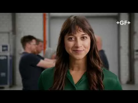
I hadn’t heard of GF Piping Systems, and I definitely wasn’t aware of how their next generation pipes worked, but within a week, I’d researched, written, and edited this script.

Worked with the team at Archetype to help sculpt a new verbal identity for B2B healthcare giant FinThrive. Their thing? Silky smooth, end-to-end automated software for healthcare revenue management in the US. You know, the effortless type that takes all the stress out of chasing payments and payees. The tone of voice is bound to secrecy, but feel free to enjoy the brand film instead.

Concepted and wrote this interactive, SEO-ready web copy for events agency One Point Five, as part of a wider branding project. Check it out here.

Autumn is a lovely time of year. Browning leaves jangle on trees like excitable bells, pumpkins pop back up on seasonal restaurant menus, and Puma switches from Spring Summer capsule to its Autumn Winter counterpart. Puma asked me to help out with some straplines for web, email, and window displays to celebrate.

What one thing do you need on your ‘ollibobs? The Platinum travel credit card from Barclaycard.
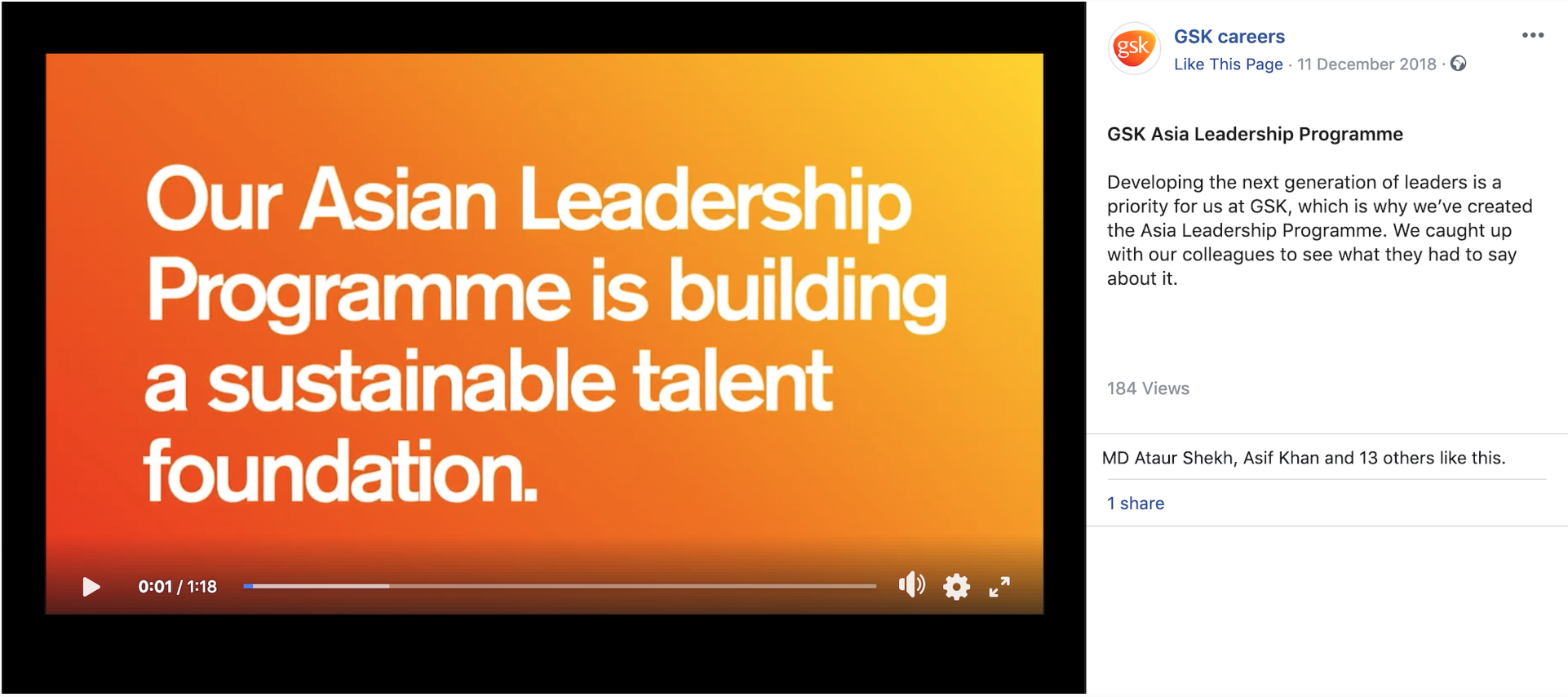
During my time at Publicis, a designer and I would turn a series of GSK workplace events and themes — sustainability/mentorship/LGBTQ+ — into social posts every month.

In the face of a climate breakdown, Green New Deal is fighting for our government to develop a game-changing plan for health, jobs and climate action. I wrote a series of paid social posts, using real-life case studies and interviews, to get people on board. (More available on request.)

Researched and wrote a number of SEO-ready articles for the good people at Reboxed. They’re on a mission to rehome 100 million smartphones by 2030, some challenge. Wrap your peepers around their blog, here.

SEO-ready web copy for West London hotel, The Columbia. Full site here.

Catering titans Compass Group needed an identity for one of their seasonal pop ups… Spanish. I worked alongside illustrator Caro Gates on Mas Y Mas. Translating as ‘more and more’, flowing watercolours represent the slow, passionate preparation that goes into every Spanish ingredient and dish. A celebration of heritage and sun-kissed scran.


London PR company MSL needed a brand for a new employee training programme. I worked alongside James Burbidge (designer) to bring it to life with words and pictures. The driving force behind the idea was toolbox: giving you the skills you need to succeed.


Every year, tens of thousands gather from London’s LGBTQ+ community and beyond to celebrate diversity in all its forms. I contributed to Pride in London’s website in the run up to their 2019 edition. All here.

A series of print adverts for the Bank of Scotland, who were on the lookout for talent for their branches. (More on request.)